Dashboard basics
Dashboards help you monitor and access the most important aspects of your business. They provide at-a-glance insights into your company and can be customized for specific roles. This makes it easy for users to see the information that's relevant to them.
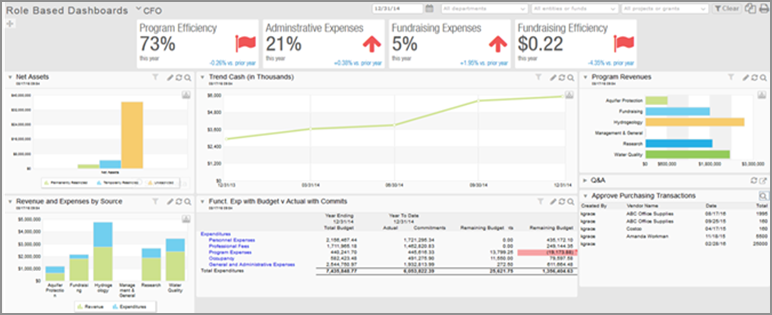
The following dashboard is set up for a CFO. The dashboard includes charts, graphs, performance cards, reports, and records relevant to what a CFO needs to know. You can drill down into reports and records right from the dashboard, making it easy to learn more and act on the data.
Videos
The best way to learn about dashboards is to create your own. If you prefer to learn by watching videos, this section is for you.
Rather read about it? Skip down to the Understand the basics section.
Step 1: Create a dashboard
Step 2: Add components to your dashboard
Training
Sage University provides on-demand training that you can take at your own pace. The courses are designed to help new users get started with Sage Intacct quickly.

Financial reporting and dashboards
This course teaches you the essentials of using the Financial Report Writer and covers creating graphs and dashboards.

See all on-demand training
Get up to speed quickly with short video tutorials and interactive training modules.
Understand the basics
There are 3 ways to add a dashboard.
If your company was set up with a QuickStart template, it contains a library of predefined dashboards that you can install and use right away. Some dashboards require you to install additional account groups, graphs, or financial reports to display properly. And you can use the dashboards as-is or customize them to suite your needs.
To find out if your company was created using a QuickStart template, go to the Accounting tab on the Company information page (Company > Setup > Configuration > Company).
If a template was used, the type appears in the QuickStart template field. If the field is blank, the company was not set up using a template.
- Go to Dashboards > All > Dashboards.
- Select the Create dropdown button, and then select Create from catalog.
- Find the dashboard and select Install.
- Optionally, change the Dashboard name.
- Select Save and then Close.
- When you’re finished, select Done to return to the Dashboards list.
- Go to Dashboards > All > Dashboards.
- Select Dashboards library.
- Find the dashboard and select Install.
- Optionally, change the Dashboard name.
- Select Save and then Close.
- When you’re finished, select Done to return to the Dashboards list.
You cannot edit another person's dashboards, but you can clone them, and then edit the clone.
- Go to Dashboards > All and select the dashboard that you're cloning.
- In the upper right, select Clone.
- In the Dashboard properties window, enter a new Title.
-
Make any needed changes on the Appearance, Filters, and Permissions tabs.
Use the field descriptions as a guide.
-
Select Save.
Now you can select Edit for a component to customize it as needed. After you save your changes to the report or graph, select Refresh to refresh the data.
To start with a blank slate, you can add an empty dashboard and then add your components.
- Go to Dashboards > All and select Add (circle) next to Dashboards.
-
Use the Appearance, Filters, and Permissions tabs to set up the new dashboard.
Use the field descriptions as a guide.
- Select Save.
After you've created your dashboard, you can add components. The following are a few examples. You can find more in the Help Center.
- Go to Dashboards > All and find the dashboard in the list.
-
Select Components.
Select View components.
- In the upper right corner of the dashboard window, select Add.
- In the Component type field, select Chart.
- From the Chart type list, select Financial chart or Memorized chart.
-
From the Component list, select the graph.
-
Set other options.
- Component title: enter a heading to appear on the dashboard.
- Chart style: select the type of graph.
- X label: select how to display labels for the horizontal axis.
-
Legend: select where to put the legend in relation to the graph.
Legend placement is available for Stacked column, Stacked bar, Area, and Stacked area graph types.
- Font size: for graphs with a significant amount of text, use a smaller font size.
-
Height: set the vertical size of the component.
The graph scales to fill the available space.
-
Select Save.
Add a report to a dashboard:
- Financial report: All financial reports can be added.
- Standard report: Memorize the report before adding it.
- Custom report: Memorize the report before adding it.
Do not add large reports to a dashboard that's used as a start page, particularly if it's the start page for multiple people. Large reports can slow down a dashboard, especially if the dashboard is used by multiple people at the same time.
- Go to Dashboards > All > Dashboards.
- Find the dashboard in the list.
-
Select Components.
Select View components.
- In the upper right corner of the dashboard window, select Add.
- In the Component type dropdown list, select Report.
- In the Report source dropdown list, select the type of report that you're adding.
- Optionally, limit the list of reports by selecting a Report type or a Report audience.
-
In the Component dropdown list, select the report.
Don't see the report? Standard reports and custom reports must be memorized before you can add them to a dashboard. Memorizing a report gives the report a name and retains the report settings, so you do not have to select them each time you want to run the report. -
Set the following options, as needed:
- Component title: Enter a heading to appear on the dashboard.
-
Rows: Select how many rows to show.
The title occupies 2 rows.
- Automatic height: Select checkbox to show all rows with no scrolling.
-
Height: Limit the vertical size of the component on the dashboard.
You can then scroll if there are more rows that what can fit in the allotted size.
The number of columns in the dashboard automatically determines the width of the report. -
Report view:
-
Select Snapshot to update the report when you refresh.
-
Select Live to have Intacct regularly update it the report.
Although the report is updated regularly, you might need to refresh the browser or move away from the page and back to see the latest report results.
If you do not need filtering for a report, select Snapshot. This reduces processing needs for the report, which helps your dashboard perform better.
-
-
Dashboard filtering: Select this checkbox to have dashboard filters are applied to the report.
This field is available if you select Live in the Report view field.
- Show collapsed: Show only the title, along with an arrow to expand the report.
-
Select Save.
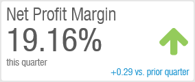
Each performance card sits at the top of a dashboard and reports a single value. The foundation of each performance card is an account group, which you select. The account group determines the value that users see.
- Go to Dashboards > All > Dashboards.
- Find the dashboard in the list.
-
Select Components.
Select View components.
- In the upper right corner, select Add.
- In the Component type field, select Performance cards.
-
On the Appearance tab, use the following field descriptions to customize the performance card.
Performance card components - Appearance tab Field
Description
Title
Enter a brief label to show above the performance card value, such as Net Profit Margin.
Account group
Select an account group that's based on one of the following:
- A single GL account, such as revenue
-
A computation, such as Net Profit Margin, consisting of several account groups.
If you do not see the account group that you need, create a new one.
Reporting period
Select the time span that you're reporting on.
Show as
Specify whether the value is shown as a number, currency amount, or percentage.
The account group determines the format of the value, such as 12 versus 0.12. Selecting Percentage - append % sign does not shift the decimal point.
Rounding
Select how much precision to show for the performance card value.
- No rounding: Show all digits for the number of decimal places defined for an account group—up to 8 places for performance cards. For example, for a value of 12.340600:
- If the account group is set to display 2 decimal places, the performance card displays 12.34.
- If the account group is computational and is set to 6 decimal places, the performance card displays 12.340600.
Only computational account groups can set a specific number of decimal numbers, but account groups can be members of multiple account groups.
- Whole number: Show all digits to the left of the decimal place.
- Thousands: Abbreviate with K. For values less than 10,000, show 1 decimal place. For example:
- 111,444,777.99 appears as 111,444K
- 9,444.99 appears as 9.4K
- Millions: Abbreviate with M. For values less than 100,000,000 and greater than 10,000,000, show up to 1 decimal place. For values less than 10,000,000, show 2 decimal places. For example:
- 111,444,777.99 appears as 111M
- 99,444,777.99 appears as 99.4M
- 9,444,777.99 appears as 9.44M
How does rounding apply in performance cards?- If the rounding will obscure visibility, rounding is ignored. For example, it might appear as a zero if the amount is set to 1000 but the rounding is set to Millions.
- If the numbers are positive or negative: The maximum number of characters allowed is 11, including the currency sign and a negative sign if there are negative numbers. Positive numbers do not consume a character in the count.
- For budget or period comparisons, 9 characters are allowed. This limit includes the currency sign and negative sign if the comparison is a negative value.
Reporting book
Report on 1 book or combine amounts from multiple books.
Appears if you have multiple books.
Comparison
Choices are based on the Reporting period that you select.
Period comparisons
- Finished period: To compare a value from one entire period with a value from another entire period (instead of a partial amount for the current incomplete period):
- In the Reporting period field, select a Prior... period option, such as Prior Month or Prior Quarter.
- In the Compare to field, select Period.
- In the field to the right, select a prior period for comparison.
- Current period: To compare a value from a current period (such as Current Year To Date) against a partial prior period (up to the same point):
- In the Reporting period field, select a Current... period option, such as Current Month To Date or Current Quarter To Date.
- In the Compare to field, select Period.
- In the field to the right, select a prior period for comparison.
- Day: To compare a single date (based on the As Of Date for the dashboard) against the same date in another period:
- In the Reporting period field, select Today.
- In the Compare to field, select Period.
In the fields to the right, select the number of prior years, quarters, months, weeks, or days.
For example, if the As-of date for the dashboard is 1/1/2025, comparing to a period of 1 year ago compares against 1/1/1/2024.
Budget comparisons
Budget: Select a budget that you've set up.
No comparison
None: Report on a standalone value, such as Days Sales Outstanding or Days Cash on Hand.
You can create performance cards that compare an actual figure against a budget. However, creating a computation within an account group with the numerator and denominator coming from different actual versus budget is not supported. In this case, consider a graphical approach to get the comparison with a visualization.Grouping
Organize related performance cards into a group, which you can move and align as a single unit on the dashboard.
-
On the Filters tab, specify how the performance card will be filtered.
Performance card components - Filters tab Field Description Dashboard filtering -
Select Allow to filter the component when the dashboard-level filters at the top of the dashboard are applied.
-
Select Prevent to exclude the component from dashboard-level filtering.
For example, you have $100,000 in assets in Chicago and $200,000 in assets in San Francisco.
-
If you prevent dashboard filtering (and have no performance card filters), an Assets performance card always shows a value of $300,000.
-
If you allow dashboard filtering, the performance card initially shows a value of $300,000. If you set up a dashboard filter for Location and select Chicago, the performance card shows $100,000. Select San Francisco, and the performance card shows $200,000.
Dimensions The dimensions that are enabled in your company are listed. Select a dimension to filter the component by that dimension.
For example, if you're using the Location dimension, you can filter by a specific location, or by a location group and all its sub-locations.
-
-
Select Save.
- See the topics on the Maintain dashboards page to learn about filtering and grouping dashboards, dashboard permissions, and more.
- Learn how to make a dashboard your home page.
- Share your dashboards with others in your organization.