Display and interactions—User preferences
Related information
 Related topics
You can personalize your Sage Intacct experience by customizing appearance settings like your start page and menu order, and defining record defaults for lists and tables. Additionally, you can refine interactive behaviors such as auto-complete suggestions and keyboard navigation to streamline how you work across applications.
To access your user preferences:
- Select your login name at the top of any Sage Intacct page and select My preferences.
Display settings
Use the fields in these sections to change your preferences for the following:
- Appearance
- Menu
- Page and list defaults
- Interactive behavior
- Attachment split view
- Platform and Customization Services UI and scripts
Appearance
| Preference option | Description |
|---|---|
|
Your start page is the page that displays when you first login to Sage Intacct. The Default start page is Intacct 's homepage that displays product updates and resource links. You can select the overview page of any application or you can select a dashboard as your start page. If you select Dashboard as your start page, the My start dashboard dropdown list appears. Select a specific dashboard from the dropdown list. |
|
|
Manage my dashboards |
Create, edit, and manage your dashboards. See About Dashboards for information on this topic. |
Menu
| Preference option | Description |
|---|---|
|
The trigger that makes the navigation menu open. Options are:
|
|
|
Change the order of the applications on your menu bar. Drag and drop an application bar item to a new location on the bar. |
Page and list defaults
| Preference option | Description |
|---|---|
|
List pages: Records per page |
Select the number of lines to display in pages that provide lists of records. The default is 20 lines per page. You can change this number to accommodate your monitor's resolution and line speed. The greater the number, the more lines you can see without selecting Next. If you have a slow Internet connection, increasing the line number might increase the time it takes to load the additional data. |
|
Selection list pop-ups: Items per page |
Select the number of lines to display in popup window selection pages in the event that there are more items than the dropdown list displays. The default is 15 lines. |
|
Dropdown lists: Items per dropdown |
Select the number of list items to display in dropdown menu lists. The default is 1,000 list items. You can set up to 5,000 list items in a dropdown list. If you have more than 5,000 list items, Intacct displays the pick window instead. The larger the number of list items, the longer the list of data Sage Intacct will need to load in the background. Long lists can slow down the page refresh rate. |
|
Transaction rows: Per transaction |
Select the number of rows displayed in the Entries section by default when adding a new transaction. This applies to multi-line edit pages such as AP supplier invoices, AR sales invoices, expense reports, adjustments, and so on. For example, if you set the default to two rows and add a new expense report, Intacct displays two empty rows in the Expense entries section. This setting only applies to the default number of entry rows. You can add additional entry rows to every transaction by selecting the plus icon at the end of a row. |
|
Fast entry row: For splitting transactions |
Set the number of blank lines to be used for splitting the transaction across two or more account-department-location combinations (applies to fast-entry AP supplier invoices, cheques, and AR sales invoices pages). The default is two lines. You can always split the transaction across at least two accounts before you need to add more lines. However, if you regularly split transactions across more than two lines, enter that number here. You can set up to six lines. |
|
Transaction tables: Rows per page |
Select the number of transaction rows that you can view before you need to page to view the next set of rows. This setting is applicable to pages that have tables that list transactions, like Pay Bills. |
Interactive behavior
| Preference option | Description |
|---|---|
|
Automatically insert a decimal point in numbers |
Select this checkbox if you want Intacct to place a decimal point before the last two numbers entered. For example, if you enter 1056, Intacct interprets this value as 10.56. Clear this checkbox if you want Intacct to place a decimal point at the end of the number entered and then add two zeroes. For example, if you enter 1056 Intacct interprets this value as 1,056.00. Intacct formats the number when you tab out of a field on any transaction page. |
|
Display type-ahead suggestions as you type |
Select whether you want Intacct to anticipate and display suggestions as you type. Intacct can anticipate what you will type next by displaying the word it thinks you’ll type, so you do not have to enter the entire word. For example, say that you have a customer named Franklin. As you enter the first characters "F...r...," Intacct supplies "Franklin." To suggest name values, Intacct locally caches all of your customer names. While this speeds data entry, it also adds time to page downloads. If pages take an excessively long time to load, you can clear this checkbox. |
|
Display all fields per line item |
Select this checkbox only if you want to see a line item and all its details on one long line. Unless you have a specific reason for enabling this option, we recommend that you use the default Show details sections on entry rows to contain infrequently used fields. Sage Intacct Administrators can move the fields that appear in the entry layout for pages like Journal Entry, Sales transaction entry, and so on. |
|
Always expand the details area when selecting line items |
Select this checkbox only if you always want to show the details area when selecting line items. If you do not always need to see the details, we recommend that you use the Show details or Hide details links in an entry row to control the display of the details section. |
|
Use the Enter key to move between fields |
Select this checkbox to use the Enter key to move between fields. When this setting is on, you can use either Enter or Tab to move between fields. This setting works in most pages except reports and lists—the behavior of the Enter key is not changed in those pages. To insert a line break when this setting is on, like for example in a description text field, press Shift+Enter. |
|
Set Import service review screen default to hide empty columns |
Select this checkbox to automatically hide empty columns of data from view by default on every import review page when using the Import service. In an import service worksheet, use the Manage columns tool to show or hide any column of data in your imports. |
|
Quick view |
This preference option was originally designed for a legacy Intacct user interface that's no longer in use. Because the current interface no longer uses this setting, selecting either the Enable or Auto-collapse Quick view options will not change your experience in the modern user interface. Quick view behavior is only visible in a small number of pages that continue to use the legacy user interface and only in the Accounts Receivable, Accounts Payable, and General Ledger applications. Current behavior when the Enable checkbox is selected:
The Auto-collapse checkbox does not affect the modern interface or remaining legacy pages. |
|
Default attachment folder |
Save time when attaching files by automatically filling the Folder field wherever attachments can be added—such as when adding customers, editing AP supplier invoices, and more. Depending on your user type, this field behaves as follows:
|
Attachment split view
These fields are only applicable to viewing attachments in AP supplier invoices. If you want to see a split view of the AP supplier invoice and the AP supplier invoices list in the enhanced user interface, see Split a list view.
| Preference option | Description |
|---|---|
|
Enable split view |
View an attachment side-by-side with the record details on the same window in an AP supplier invoice. Split view is available when the following criteria are met:
This functionality is currently only applicable to viewing attachments on the AP supplier invoice page in Accounts Payable. |
|
Show split view on page load |
If a AP supplier invoice has an attachment, the attachment appears in split view when you open the AP supplier invoice, This field displays after you select Enable split view. |
Platform and Customization Services UI and scripts
| Preference option | Description |
|---|---|
|
|
|
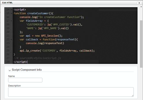
Script component theme |
Select Light mode or Dark mode. Dark mode only applies to the script editing component as in the following example:
This option is only applicable if Display layout in new user interface: Platform and Customization Services is selected. |
|
Script component debug all scripts |
Select On or Off. Selecting On enables the autogeneration of debug file names for inline page scripts. All automatically generated debug file names follow the naming conventions This option is only applicable if Display layout in new user interface: Platform and Customization Services is selected. |
On-screen messages
Use these preference options to manage alerts for validation errors, deletion confirmations, and unsaved changes.
| Preference option | Description |
|---|---|
|
Warn on unsaved changes |
Select this checkbox to display a confirmation message when you make changes to a record and then try to navigate away from the page without saving your changes. |
|
Warn on delete |
Select this checkbox to display a confirmation message when you try to delete a record. This can help prevent data loss. |
|
Display validation messages on a separate screen |
Select this checkbox if you want your messages to appear on a separate page rather than inline on the page you’re editing. For example, when you save information you entered on the Supplier Information page, Intacct checks the required fields, such as Supplier Name and Print As, to make sure that you entered that information. If you did not enter the expected information, Intacct displays the alert in a separate page rather than at the top of the page. |