Data series for General Ledger graphs
When you create a financial graph, your choices for data series represent how you want to categorize the data. For example, a revenue graph can be broken down in multiple ways, such as by quarter, location, or customer.
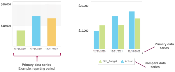
Primary vs. Compare data series
Think of the Primary data series as the main way you want to categorize values, such as by reporting period, account group, dimension, or dimension structure (waterfall charts only).
For some types of graphs, you can optionally show a comparison within the primary data series. A Compare data series is available for all chart types except pie, doughnut, and waterfall.
For example, suppose you set up a column graph to show revenue, and to use a reporting period of calendar year as the primary data series.
If the graph uses only the primary data series, it shows revenue as one column for each year.
If the graph uses the primary data series and a compare data series, it shows two columns for each year based on what's selected in the compare data series. If the compare data series compares budget to actual revenue, each year in the graph would show one column for budget and one column for actual, allowing you to compare the budget to actual revenue for each year shown.
Regardless of how you set up data series', the main data being shown (in this case revenue) is determined by the account group selected in Additional parameters.
Data series options
The way that data series are displayed depends on the graph type.
| Option | Available graph types | Description |
|---|---|---|
| Account groups | All | Categorizes data by 1 or more account groups. Example: Revenue vs. expense. |
| Reporting periods | All |
Categorizes data by 1 or more reporting periods. Example: Four consecutive quarters. Although you can select individual reporting periods by moving them from Available to Selected, the quickest way to create a trend over time is to use the Period comparison options. |
| Budget comparison | All except for pie, doughnut, and waterfall. | Lets you compare Actual values against 1 or more budgets. |
| Dimension | All |
Categorizes data by the selected dimension. By default, the graph shows all members of each dimension. However, you can filter on a dimension group to show a subset of members. For example, suppose that you choose Locations as a data series.
|
| Dimension structure | Waterfall only |
In waterfall charts, categorizes data based on the substructures in a hierarchical dimension structure. About hierarchical dimension structures
A hierarchical dimension structure contains other dimension structures. In the case of waterfall charts, the dimension structures that are one-level down in the hierarchy are used to create the intermediate columns. Example Suppose that you have a hierarchical location structure called US Locations. When you view the structure definition, you see that:
Resulting waterfall chart When you set the primary data series to dimension structure and select US Locations, the substructures (East, Midwest, and West) become the intermediate columns in the waterfall chart.
These substructures can be either hierarchical or flat. If the dimension structures at this level are also hierarchical, amounts will be rolled up from the locations at lower levels.
Learn more about creating dimension structures. Selecting a dimension structure, rather than a dimension, gives you the freedom to create intermediate columns based on how you want to segment and label the data.
|