Create financial graphs
Related information
Graphs help you visualize trends in your business, telling a story that goes beyond the numbers on a page. Using the General Ledger Graph page, you can design any number of graphs, which can be displayed on their own or added to a dashboard.
You can create or edit a graph from the Graphs list on the General Ledger menu or from the Reports center. Go to General Ledger > All > Core, then select Add (circle) next to Financial graphs, or select Financial graphs, then select Edit next to an existing graph.
To create or edit a graph from Reports center, select Reports > All > Reports > Core > Financial graphs.
| Subscription |
General Ledger |
|---|---|
| Regional availability |
All regions |
| User type |
Business |
| Permissions |
List, View, Add Financial Graphs |
Graph editor controls
The graph editor has 2 main parts, separated onto the left and right sides. Below is an image of the graph editor, with selected elements indicated by numbers 1-4, which are described below the image.
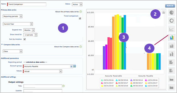
1: Use the controls on the left side to design your graph and select graph data.
2: Select Refresh at the top right to start or refresh the graph.
3: The right side is reserved for a graph preview, which shows what your graph looks like using your actual data.
4: Icons on the right edge let you switch graph types.
Preview and refresh
When you first create a graph, the preview is empty. Enter some basic graph information, then select Refresh to start seeing the preview.
As you make changes, be sure to refresh again to see the latest updates.
Create a graph
Here's one approach to graph design. However, you can select options and pick a graph type at any time.
- Enter a Name for the graph.
You can change the name later, even after you save.
- Select the data that you want to see in your graph.
The data displayed is a combination of the data series used to categorize values (for example, your columns or pie chart slices) and the accounting data specified in Additional parameters. All graphs have at least a Primary data series. For some graph types, you can optionally include a Compare data series. Any data that's not selected as a data series is specified as Additional parameters.
For example, suppose you set up a column graph to show revenue, and to use a reporting period of calendar year as the primary data series.
If the graph uses only the primary data series, it shows revenue as one column for each year.
If the graph uses the primary data series and a compare data series, it shows two columns for each year based on what's selected in the compare data series. If the compare data series compares budget to actual revenue, each year in the graph would show one column for budget and one column for actual, allowing you to compare the budget to actual revenue for each year shown.
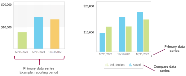
Regardless of how you set up data series', the main data being shown (in this case revenue) is determined by the account group selected in Additional parameters.
- Select a graph type by selecting an icon to the right of the preview.
- The currently selected graph type appears in color.
- Column graph
 is the default, but there are other graph types including pie, doughnut, line, column, bar, area, and waterfall.
 - Hover over an icon to see the name of the graph type. If the graph can be displayed only on the page, "(HTML only)" is appended to the name, as in "Stacked column (HTML only)" and "Doughnut (HTML only)".
- When a doughnut graph is selected, it will appear as a pie chart for PDF output.
- Use Additional settings to refine your output.
- Title, subtitle, and comment apply to PDF output only.
- In most cases, you'll want to leave the As of date blank to automatically use the current date. You can override the date when the graph is viewed to see data from different time periods.
- Select Hide zero numbers to remove data points that have no value. For example, if your graph compares revenue by customer, select this option to remove data points for customers with no associated revenue during the reporting period.This option has no effect when using a graph to show budget data, because budget items with no value or zero value are always hidden.
- Select to expand the Filters section, and filter your report as needed.
Filtering lets you select data based on dimension (such as by location, department, item, customer, or project) in the following ways:
- filter for a single dimension member. such as a particular location.
- filter for multiple dimension members, such as for a group of locations or a particular customer type.