Create graphs from CRW reports
You can add graphs to a dashboard. However, a graph that is report output appears on the dashboard as a report, not as the actual graph.
Graphs show visual trends in a business that convey meaning beyond numbers on a page. Custom report writer allows you to design graphs that can be displayed on their own or added to a dashboard.
| Subscription |
Customization Services or Platform Services |
|---|---|
| Regional availability |
All regions |
| User type | Business or Admin |
| Permissions | Custom reports: List, View, Edit, Add, Delete |
Create the report for the graph
- Plan your report and the data to be included.
- Open the Custom Report Writer (CRW) and follow the next steps to add a custom report. The number of steps depends on the report.
- Select a data source and add any required prompts.
- Set the output to Graph, select Save, and then select Go to run the report. If you run the report later, select Graph for the report type.
- Add the columns to include followed by the sequence.
- Define filters and grouping. You must enable grouping to create a graph from a custom report.
- Define the chart output. If you don't see this option, you have created a report that can't be output as a graph.
- Select the chart type and then choose the columns for the X axis and the Y axis. The X axis should be a calculation.
- Select the grouping, for groups with multiple members, and then choose the label and legend positions, font size, and graph size.
Chart types
Select the type of graph to output the report. Use the types list below to determine the most appropriate graph type to use.
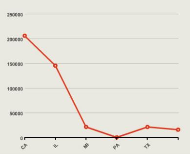
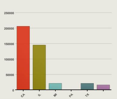
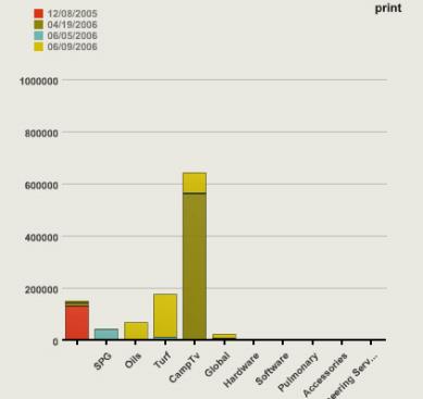
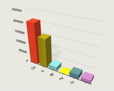
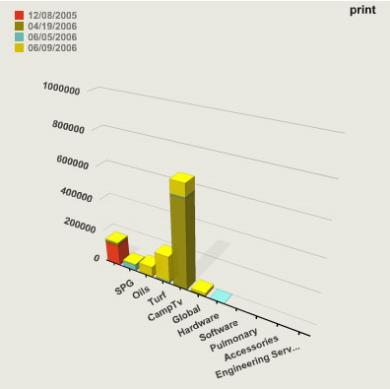
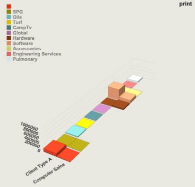
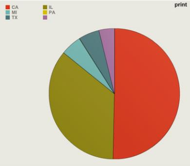
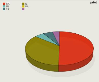
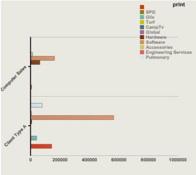
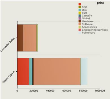
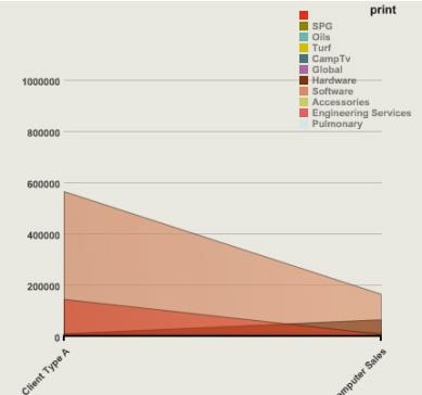
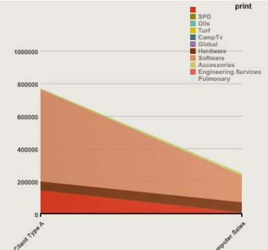
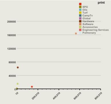
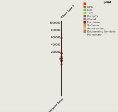
Graph types for the custom report writer
These examples show the different chart types available for use with the custom report writer.
Add the report to a dashboard
Graphs can be added to dashboards, but graphs that are report outputs appear on the dashboard as the report, not as the actual graph.
Standard graphs can be added to the dashboard as graphs.
